Vuetify.js のスニペット集
このページは、Vuetify.js のスニペットをまとめる予定のページです。
目次
注意
- コードのライセンスは CC0 (クレジット表示不要、改変可、商用可) です。
- Nuxt.js + TypeScript で使用するためのスニペットになっていることが多いです。
- Nuxt.js v2.12.2 時点のコードです。将来のバージョンでは動作しない可能性があります。
スニペット
日本語設定
Nuxt.js (プラグイン)
import Vue from 'vue'
import Vuetify from 'vuetify'

Vue.use(Vuetify)

import ja from 'vuetify/src/locale/ja'

export default new Vuetify({
  lang: {
    locales: { ja },
    current: 'ja',
  }
})
  plugins: [
    '~/plugins/vuetify'
  ],
Nuxt.js (optionsPath)
本番ビルドなどで treeShake が true の状態だと plugins/vuetify.ts のオプション設定が反映されないようなので、オプション設定が反映されるように nuxt.config.js の optionsPath 経由で設定します。
import ja from 'vuetify/src/locale/ja'

export default {
  lang: {
    locales: { ja },
    current: 'ja',
  }
}
  // ...
  vuetify: {
    // ...
    optionsPath: './vuetify.options.ts', // オプション設定ファイルのパス
    // ...
  },
- nuxt-community/vuetify-module: Vuetify Module for Nuxt.js
- vuetify.js - Nuxt Vuetify Module - Custom Component icons does't work - Stack Overflow
アイコン (<v-icon>)
Nuxt.js (プラグイン) + mdiSvg
グローバル上に必要なアイコンのみ定義して使用します。
npm install @mdi/js -D
import Vue from 'vue'
import Vuetify from 'vuetify'
import { mdiAccount, mdiLock } from '@mdi/js' // アイコン読み込み

Vue.use(Vuetify)

export default new Vuetify({
  icons: {
    iconfont: 'mdiSvg',
    // アイコン定義
    values: {
      account: mdiAccount,
      lock: mdiLock,
    }
  },
})
  plugins: [
    '~/plugins/vuetify'
  ],
  // ...
  vuetify: {
    // ...
    defaultAssets: false, // デフォルトのアイコンやフォントを読み込まない
   // ...
  },
<template>
  <div>
    <!-- アイコン -->
    <v-icon x-large>$account</v-icon>
    <!-- テキスト欄 -->
    <v-text-field prepend-icon="$lock" />
  </div>
</template>

<script lang="ts">
import Vue from 'vue'

export default Vue.extend({
})
</script>
- 補足
plugins/vuetify.tsは前述の日本語設定 (Nuxt.js (プラグイン)) とまとめても OK です。
- 参考
Nuxt.js (optionsPath) + mdiSvg
本番ビルドなどで treeShake が true の状態だと plugins/vuetify.ts のオプション設定が反映されないようなので、オプション設定が反映されるように nuxt.config.js の optionsPath 経由で設定します。
npm install @mdi/js -D
import { mdiAccount, mdiLock } from '@mdi/js' // アイコン読み込み

export default {
  icons: {
    iconfont: 'mdiSvg',
    values: {
      account: mdiAccount,
      lock: mdiLock,
    }
  },
}
  // ...
  vuetify: {
    // ...
    defaultAssets: false, // デフォルトのアイコンやフォントを読み込まない
    optionsPath: './vuetify.options.ts', // オプション設定ファイルのパス
    // ...
  },
<template>
  <div>
    <!-- アイコン -->
    <v-icon x-large>$account</v-icon>
    <!-- テキスト欄 -->
    <v-text-field prepend-icon="$lock" />
  </div>
</template>

<script lang="ts">
import Vue from 'vue'

export default Vue.extend({
})
</script>
- 補足
vuetify.options.tsは前述の日本語設定 (Nuxt.js (optionsPath)) とまとめても OK です。
テーマ
ダークモードの切り替え
this.$vuetify.theme.dark = true;
アラート (<v-alert>)
<v-alert type="success">success</v-alert>
<v-alert type="info">info</v-alert>
<v-alert type="warning">warning</v-alert>
<v-alert type="error">error</v-alert>
ボタン (<v-btn>)
通常のボタン
<v-btn>ボタン</v-btn>
アイコン付きボタン
<v-btn>
  <v-icon>$ratingFull</v-icon>
  ボタン
</v-btn>

大きめのボタン
<v-btn block x-large>ボタン</v-btn>

アイコンボタン
<v-btn icon>
  <v-icon>$ratingFull</v-icon>
</v-btn>

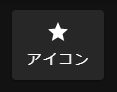
アイコンボタン (アイコン + 下部テキスト)
<template>
  <div>
    <v-btn x-large class="btn-icon">
      <v-icon>$ratingFull</v-icon>
      <div class="btn-icon-text">アイコン</div>
    </v-btn>
  </div>
</template>

<style scoped>
.btn-icon {
  padding: 10px !important;
  height: auto !important;
}
.btn-icon >>> .v-btn__content {
  flex-direction: column;
}
.btn-icon-text {
  margin: 5px 0 0;
  font-size: 0.9rem;
}
</style>
グリッド
2列
<v-container>
  <v-row>
    <v-col>

    </v-col>
    <v-col>

    </v-col>
  </v-row>
</v-container>
<v-container>
  <v-row>
    <v-col cols="12" md="6">

    </v-col>
    <v-col cols="12" md="6">

    </v-col>
  </v-row>
</v-container>
カード (<v-card>)
シンプルなカード
<v-card>
  <v-card-title>title</v-card-title>
  <v-card-text>
      test
  </v-card-text>
</v-card>
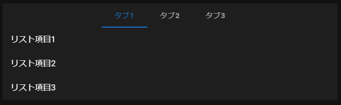
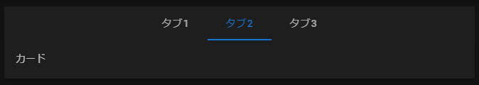
タブ (<v-tabs>)
<v-tabs centered>
  <v-tab key="tab1">タブ1</v-tab>
  <v-tab key="tab2">タブ2</v-tab>
  <v-tab key="tab3">タブ3</v-tab>

  <!-- タブ1 -->
  <v-tab-item key="tab1" transition="fade-transition" reverse-transition="fade-transition">
    <v-list-item-group>
      <v-list-item>リスト項目1</v-list-item>
      <v-list-item>リスト項目2</v-list-item>
      <v-list-item>リスト項目3</v-list-item>
    </v-list-item-group>
  </v-tab-item>

  <!-- タブ2 -->
  <v-tab-item class="pa-0" key="tab2" transition="fade-transition" reverse-transition="fade-transition">
    <v-card>
      <v-card-text>
        カード
      </v-card-text>
    </v-card>
  </v-tab-item>

  <!-- タブ3 -->
  <v-tab-item key="tab3" transition="fade-transition" reverse-transition="fade-transition">
  </v-tab-item>
</v-tabs>
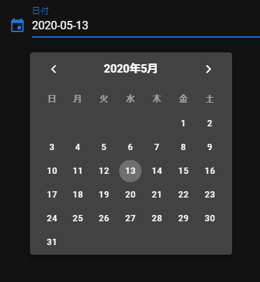
日付ピッカー (<v-date-picker>)
テキスト欄クリックで日付ピッカー表示
<template>
  <div>
    <v-menu
      offset-y nudge-right="30" min-width="0"
      :close-on-content-click="false"
      v-model="dateMenu"
    >
      <template v-slot:activator="{ on }">
        <v-text-field
          label="日付"
          prepend-icon="event"
          readonly
          :value="date"
          v-on="on"
        ></v-text-field>
      </template>
      <v-date-picker
        no-title
        locale="ja-jp"
        :day-format="d => new Date(d).getDate()"
        v-model="date"
        @input="dateMenu = false"
        @change="onDateChange"
      ></v-date-picker>
    </v-menu>
  </div>
</template>

<script lang="ts">
import Vue from 'vue'

export default Vue.extend({
  data () {
    // const d = new Date();
    return {
      // date: `${d.getFullYear()}-${('00' + (d.getMonth() + 1)).slice(-2)}-${('00' + d.getDate()).slice(-2)}`,
      date: null,
      dateMenu: false,
    }
  },
  methods: {
    onDateChange () {
      console.log(this.date);
    }
  }
})
</script>
- 補足
locale="ja-jp"はグローバルで日本語設定ができていれば不要です。prepend-icon="event"は Material Icons アイコン (md) を使用している場合の例です。(mdiの場合はmdi-calendarなど)
- 参考
検索可能なドロップダウン (<v-autocomplete>)
<template>
  <div>
    <v-autocomplete
      outlined placeholder="選択してください" clearable
      :items="items" item-value="id" item-text="name" v-model="selected">
    </v-autocomplete>
  </div>
</template>

<script lang="ts">
import Vue from 'vue'

export default Vue.extend({
  data () {
    return {
      selected: null,
      items: [
        { id: 1, name: '山田 太郎', },
        { id: 2, name: '吉田 次郎', },
        { id: 3, name: '太田 三郎', },
      ],
    }
  },
})
</script>

- 補足
<v-autocomplete>を<v-select>にすると通常のドロップダウンになります。
- 参考
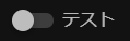
トグルスイッチ (<v-switch>)
<template>
  <div>
    <v-switch label="テスト" v-model="switch1"></v-switch>
  </div>
</template>

<script lang="ts">
import Vue from 'vue'

export default Vue.extend({
  data () {
    return {
      switch1: false,
    }
  },
})
</script>
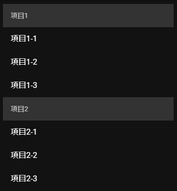
リストアイテムグループ (<v-list-item-group>)
サブヘッダー付き
<template>
  <div>
    <v-list-item-group>
      <v-subheader>項目1</v-subheader>
      <v-list-item>項目1-1</v-list-item>
      <v-list-item>項目1-2</v-list-item>
      <v-list-item>項目1-3</v-list-item>

      <v-subheader>項目2</v-subheader>
      <v-list-item>項目2-1</v-list-item>
      <v-list-item>項目2-2</v-list-item>
      <v-list-item>項目2-3</v-list-item>
    </v-list-item-group>
  </div>
</template>

<style scoped>
.v-subheader {
  background: #333;
}
</style>
<template>
  <div>
    <v-list-item-group>
      <template v-for="(item, index) in items">
        <v-subheader :key="index" v-if="index == 0 || item.header != items[index-1].header">
          {{item.header}}
        </v-subheader>
        <v-list-item :key="index">
          {{item.title}}
        </v-list-item>
      </template>
    </v-list-item-group>
  </div>
</template>

<style scoped>
.v-subheader {
  background: #333;
}
</style>

<script lang="ts">
import Vue from 'vue'

export default Vue.extend({
  data () {
    return {
      items: [
        { header: '項目1', title: '項目1-1' },
        { header: '項目1', title: '項目1-2' },
        { header: '項目1', title: '項目1-3' },
        { header: '項目2', title: '項目2-1' },
        { header: '項目2', title: '項目2-2' },
        { header: '項目2', title: '項目2-3' },
      ]
    }
  },
})
</script>
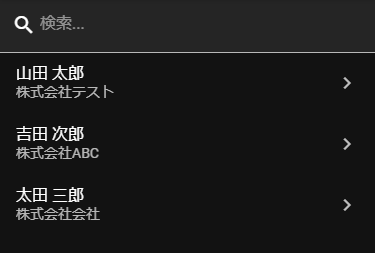
スマートフォン用リスト + 検索
<template>
  <div>
    <v-text-field
      filled
      prepend-inner-icon="mdi-magnify"
      placeholder="検索..."
      :hide-details="true"
      v-model="search" />
    <v-list-item-group>
      <template v-for="(item) in filtered">
        <v-list-item :key="item.id">
          <template v-slot:default="{ active }">
            <v-list-item-content>
              <v-list-item-title v-text="item.name"></v-list-item-title>
              <v-list-item-subtitle v-text="item.org"></v-list-item-subtitle>
            </v-list-item-content>
            <v-list-item-action>
              <v-icon v-if="!active" color="grey lighten-1">mdi-chevron-right</v-icon>
              <v-icon v-else>mdi-chevron-right</v-icon>
            </v-list-item-action>
          </template>
        </v-list-item>
      </template>
    </v-list-item-group>
  </div>
</template>

<script lang="ts">
import Vue, { PropOptions } from 'vue'
interface Item {
  id: number
  name: string
  org: string
}
export default Vue.extend({
  data () {
    return {
      items: [
        { id: 1, name: '山田 太郎', org: '株式会社テスト' },
        { id: 2, name: '吉田 次郎', org: '株式会社ABC' },
        { id: 3, name: '太田 三郎', org: '株式会社会社' },
      ],
      search: ''
    }
  },
  computed: {
    filtered(): Item[] {
      if (!this.search) return this.items;
      return this.items.filter(it => {
        return (it.name.indexOf(this.search) !== -1 || it.org.indexOf(this.search) !== -1);
      });
    }
  },
})
</script>
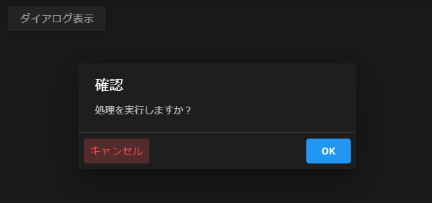
ダイアログ (<v-dialog>)
確認ダイアログ
<template>
  <div>
    <v-dialog max-width="400" persistent v-model="dialog1">
      <template v-slot:activator="{ on, attrs }">
        <v-btn v-bind="attrs" v-on="on">
          ダイアログ表示
        </v-btn>
      </template>
      <v-card>
        <v-card-title>確認</v-card-title>
        <v-card-text>
          処理を実行しますか?
        </v-card-text>
        <v-divider></v-divider>
        <v-card-actions>
          <v-btn color="error" text @click="dialog1 = false">キャンセル</v-btn>
          <v-spacer></v-spacer>
          <v-btn color="primary" @click="dialog1 = false">OK</v-btn>
        </v-card-actions>
      </v-card>
    </v-dialog>
  </div>
</template>

<script lang="ts">
import Vue from 'vue'

export default Vue.extend({
  data () {
    return {
      dialog1: false,
    }
  },
})
</script>
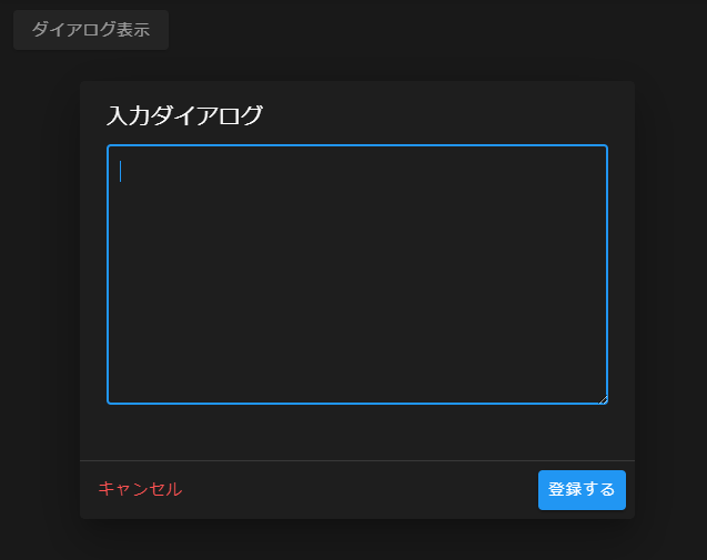
入力ダイアログ (ダイアログ表示時にテキスト欄にフォーカス)
<template>
  <div>
    <v-btn @click="onButton1Click">ダイアログ表示</v-btn>

    <v-dialog max-width="500" persistent v-model="dialog1">
      <v-card>
        <v-card-title>
          入力ダイアログ
        </v-card-title>
        <v-card-text>
          <v-textarea ref="dialogTextArea" rows="8" outlined v-model="dialogContent"></v-textarea>
        </v-card-text>
        <v-divider></v-divider>
        <v-card-actions>
          <v-btn color="error" text @click="dialog1 = false">キャンセル</v-btn>
          <v-spacer></v-spacer>
          <v-btn color="primary" @click="dialog1 = false">登録する</v-btn>
        </v-card-actions>
      </v-card>
    </v-dialog>
  </div>
</template>

<script lang="ts">
import Vue from 'vue'

export default Vue.extend({
  data () {
    return {
      dialog1: false,
      dialogContent: '',
    }
  },
  methods: {
    onButton1Click () {
      this.dialog1 = true;
      // ダイアログ表示時にテキストエリアにフォーカス
      this.$nextTick(() => setTimeout(() => (this.$refs.dialogTextArea as HTMLTextAreaElement).focus(), 100));
    },
  }
})
</script>
スナックバー (<v-snackbar>)
n秒後に閉じる (timeout)
<template>
  <div>
    <v-btn @click="onButton1Click">スナックバー表示</v-btn>

    <v-snackbar v-model="snackbar" :color="snackbarColor" :top="true" timeout="3000">
      {{ snackbarText }}
      <v-btn text @click="snackbar = false">閉じる</v-btn>
    </v-snackbar>
  </div>
</template>

<script lang="ts">
import Vue from 'vue'

export default Vue.extend({
  data () {
    return {
      snackbar: false,
      snackbarText: '',
      snackbarColor: '',
   }
  },
  methods: {
    async onButton1Click () {
      this.snackbarText = 'スナックバーを表示しました。';
      this.snackbarColor = 'success';
      this.snackbar = true;
    },
  }
})
</script>

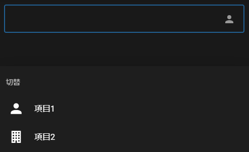
ボトムシート (<v-bottom-sheet>)
テキスト欄 + アイコンボタン + ボトムシート
<template>
  <div>
    <!-- ボトムシート -->
    <v-bottom-sheet v-model="sheet">

      <!-- 入力欄・ボタン -->
      <template v-slot:activator="{ on }">
        <v-text-field outlined clearable>
          <template slot="append">
            <v-btn class="btn-text-field" icon v-on="on">
              <v-icon>{{selectedSheetItem.icon}}</v-icon>
            </v-btn>
          </template>
        </v-text-field>
      </template>

      <!-- シート項目 -->
      <v-list>
        <v-subheader>切替</v-subheader>
        <v-list-item
          v-for="(sheetItem, index) in sheetItems"
          :key="sheetItem.title"
          @click="selectedSheetItemIndex = index; sheet = false"
        >
          <v-list-item-avatar>
            <v-avatar size="32px" tile>
              <v-icon>{{sheetItem.icon}}</v-icon>
            </v-avatar>
          </v-list-item-avatar>
          <v-list-item-title>{{sheetItem.title}}</v-list-item-title>
        </v-list-item>
      </v-list>

    </v-bottom-sheet>
  </div>
</template>

<style scoped>
.btn-text-field {
  margin-top: -6px;
}
</style>

<script lang="ts">
import Vue from 'vue'

export default Vue.extend({
  data () {
    return {
      /** シート開閉 */
      sheet: false,
      /** シート項目 */
      sheetItems: [
        { title: '項目1', icon: '$account' },
        { title: '項目2', icon: '$officeBuilding' },
      ],
      /** 選択中の項目のインデックス */
      selectedSheetItemIndex: 0,
    }
  },
  computed: {
    /** 選択中の項目 */
    selectedSheetItem (): any {
      return this.sheetItems[this.selectedSheetItemIndex];
    }
  }
})
</script>
- 補足
- アイコンは前述の
mdiSvgなどあらかじめ設定したものを使用します。(この例では$account=mdiAccount,$officeBuilding=mdiOfficeBuilding)
- アイコンは前述の
- 参考
iOS セーフエリア対応
.v-bottom-navigation {
  box-sizing: content-box;
  padding-bottom: constant(safe-area-inset-bottom);
  padding-bottom: env(safe-area-inset-bottom);
  transition: none;
}
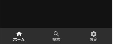
下部ナビゲーション (<v-bottom-navigation>)
<template>
  <div>
    <v-bottom-navigation app grow v-model="bottomNav">
      <v-btn value="home">
        <span>ホーム</span>
        <v-icon>$home</v-icon>
      </v-btn>

      <v-btn value="search">
        <span>検索</span>
        <v-icon>$magnify</v-icon>
      </v-btn>

      <v-btn value="settings">
        <span>設定</span>
        <v-icon>$cog</v-icon>
      </v-btn>
    </v-bottom-navigation>
  </div>
</template>

<script lang="ts">
import Vue from 'vue'

export default Vue.extend({
  data () {
    return {
      bottomNav: 'home'
    }
  },
})
</script>
- 補足
- アイコンは前述の
mdiSvgなどあらかじめ設定したものを使用します。(この例では$home=mdiHome,$magnify=mdiMagnify,$cog=mdiCog)
- アイコンは前述の
- 参考
iOS セーフエリア対応
.v-bottom-sheet.v-dialog .v-sheet.v-list {
  padding-bottom: constant(safe-area-inset-bottom);
  padding-bottom: env(safe-area-inset-bottom);
}
データテーブル (<v-data-table>)
単一選択 + 行クリック時に選択
<template>
  <v-data-table
    :headers="headers"
    :items="items"
    :items-per-page="5"
    :show-select="true"
    :single-select="true"
    :fixed-header="true"
    v-model="selected"
    @click:row="onRowClick"
  ></v-data-table>
</template>

<script lang="ts">
import Vue from 'vue'
interface Item {
  id: number
  name: string
  name_kana: string
}
export default Vue.extend({
  data () {
    return {
      headers: [
        { text: 'ID', value: 'id', width: 100 },
        { text: '名前', value: 'name' },
        { text: 'かな', value: 'name_kana' },
      ],
      items: [
        { id: 1, name: '山田 太郎', name_kana: 'やまだ たろう' },
        { id: 2, name: '吉田 次郎', name_kana: 'よしだ じろう' },
        { id: 3, name: '太田 三郎', name_kana: 'おおた さぶろう' },
      ],
      selected: [] as Item[]
    }
  },
  methods: {
    /**
     * 行クリック時 (未選択の行の場合選択する)
     */
    onRowClick: function (item: Item, params: any) {
      if (!params.isSelected) {
        this.selected.splice(0, this.selected.length, item);
      }
    }
  }
})
</script>
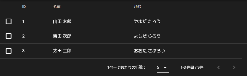
| 項目 | 説明 |
|---|---|
| headers | 列ヘッダー定義 |
| items | 行データ |
| items-per-page | 1ページに表示される行数 |
| show-select | 行頭にチェックボックスを表示するか |
| single-select | 単一選択にするか |
| fixed-header | ヘッダーを固定するか (sticky) |
| v-model | 選択行 |
| @click:row | 行クリック時イベント |
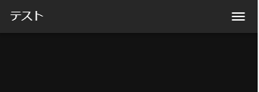
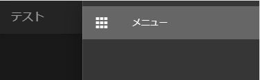
レイアウト
<template>
  <v-app>
    <v-navigation-drawer
      v-model="drawer"
      fixed app right temporary
      disable-resize-watcher
    >
      <v-list>
        <v-list-item
          v-for="(item, i) in items"
          :key="i"
          :to="item.to"
          router exact dense
        >
          <v-list-item-action>
            <v-icon>{{ item.icon }}</v-icon>
          </v-list-item-action>
          <v-list-item-content>
            <v-list-item-title v-text="item.title" />
          </v-list-item-content>
        </v-list-item>
      </v-list>
    </v-navigation-drawer>
    <v-app-bar fixed app dense clipped-right>
      <v-toolbar-title v-text="title" class="toolbar-title" />
      <v-spacer />
      <v-app-bar-nav-icon @click.stop="drawer = !drawer" />
    </v-app-bar>
    <v-content>
      <v-container>
        <nuxt />
      </v-container>
    </v-content>
  </v-app>
</template>

<style scoped>
/deep/ .toolbar-title {
  font-size: 1rem;
}
</style>

<script lang="ts">
import Vue from 'vue'
export default Vue.extend({
  data () {
    return {
      drawer: false,
      items: [
        {
          icon: 'mdi-apps',
          title: 'メニュー',
          to: '/'
        },
      ],
      title: 'テスト'
    }
  },
})
</script>
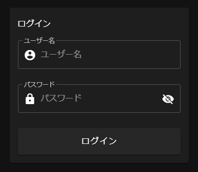
ログイン画面
<template>
  <v-app dark>
    <v-content class="mt-5">
      <v-container>
        <nuxt />
      </v-container>
    </v-content>
  </v-app>
</template>
<template>
  <v-card max-width="350" class="login-card mx-auto">
    <v-card-title>ログイン</v-card-title>
    <v-card-text>
      <v-alert text v-show="error">
          ユーザー名かパスワードが異なります。
      </v-alert>
      <v-form>
          <v-text-field
          label="ユーザー名"
          placeholder="ユーザー名"
          prepend-inner-icon="mdi-account-circle"
          outlined
          v-model="form.username"
          ></v-text-field>

          <v-text-field
          label="パスワード"
          placeholder="パスワード"
          prepend-inner-icon="mdi-lock"
          :append-icon="passwordShow ? 'mdi-eye' : 'mdi-eye-off'"
          :type="passwordShow ? 'text' : 'password'"
          outlined
          v-model="form.password"
          @click:append="passwordShow = !passwordShow"
          ></v-text-field>

          <v-btn block x-large @click="login">ログイン</v-btn>
      </v-form>
    </v-card-text>
  </v-card>
</template>

<style scoped>
.login-card >>> .v-card__title {
    font-size: 1rem;
}
.login-card >>> .v-text-field__slot > input {
    margin-left: 5px;
}
</style>

<script>
export default {
  layout: 'login',
  data () {
    return {
      form: {
        username: '',
        password: '',
      },
      passwordShow: false,
      error: false
    }
  },
  methods: {
    async login() {
      this.error = false;
    //   try {
    //     await this.$auth.loginWith('local', { data: this.form });
    //   } catch(error) {
    //     this.error = true;
    //   }
    }
  }
}
</script>