Android Drawable のスニペット集
このページは、Android の Drawable のスニペットをまとめる予定のページです。
目次
注意
- コードのライセンスは CC0 (クレジット表示不要、改変可、商用可) です。
- Android API レベル 29 時点のコードです。将来のバージョンでは動作しない可能性があります。
スニペット
有効・無効時の表示切替
<?xml version="1.0" encoding="utf-8"?>
<selector xmlns:android="http://schemas.android.com/apk/res/android">
    <item android:state_enabled="false" android:drawable="@drawable/ic_example_disabled_48dp" />
    <item android:state_enabled="true" android:drawable="@drawable/ic_example_disabled_48dp" />
</selector>
- 補足
state_enabled="true"(有効),state_enabled="false"(無効) 時の表示をandroid:drawableで定義します。- 作成した Drawable を
Buttonなどの部品のandroid:backgroundに設定します。 - 処理上 (Kotlin) では
部品.isEnabled = trueやfalseなどで有効無効を切り替えます。
- 参考
円形のボタン背景
円形の背景 (android:shape="oval") とアイコンを表示します。
<?xml version="1.0" encoding="utf-8"?>
<layer-list xmlns:android="http://schemas.android.com/apk/res/android">
    <item>
        <shape android:shape="oval">
            <solid android:color="@color/colorPrimary"></solid>
        </shape>
    </item>
    <item
        android:gravity="center"
        android:drawable="@drawable/ic_mic_white_48dp">
    </item>
</layer-list>

- 補足
- 作成した Drawable を
Buttonなどの部品のandroid:backgroundに設定します。背景の幅や高さは部品側のandroid:layout_widthやandroid:layout_heightで設定します。 - アイコンは Android Studio の場合メニューの「File」>「New」>「Vector Assets」などから作成します。
- 作成した Drawable を
- 参考
TextView の枠線
直線の枠線
<?xml version="1.0" encoding="utf-8"?>
<shape xmlns:android="http://schemas.android.com/apk/res/android" android:shape="rectangle">
    <solid android:color="@android:color/transparent" />
    <stroke android:width="1dip" android:color="#4fa5d5" />
</shape>
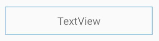
- 補足
- 作成した Drawable を
TextViewのandroid:backgroundに設定します。 android:widthで枠線の太さ、android:colorで枠線の色を変更できます。
- 作成した Drawable を
破線の枠線
<?xml version="1.0" encoding="utf-8"?>
<shape xmlns:android="http://schemas.android.com/apk/res/android" android:shape="rectangle">
    <solid android:color="@android:color/transparent" />
    <stroke
        android:width="1dip"
        android:dashWidth="10dip"
        android:dashGap="2dip"
        android:color="#4fa5d5" />
</shape>
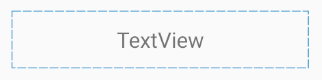
- 補足
- 作成した Drawable を
TextViewのandroid:backgroundに設定します。 android:dashWidthで破線の幅、android:dashGapで破線の間隔を変更できます。
- 作成した Drawable を